Collection of All Work
Developing Meaningful Indicators (DMI) was a module in USP taught be Dr. Charles Burke. DMI allowed us understand, use, and visualise data in a way that prioritises creating an effect on others. This is in-line with the USP’s purpose to shape independent, adaptable thinkers and doers who will make an impact in the world.
This page serves as repository of all my work created during this module. Each set of visualisation are presented in chronological order, and iterations within each set can be observed as well.
Contents
- Big 5
- Suicides
- Movie Ratings
- Sentiment Analysis
- 30% Rule
- Comparing Machine Learning
- Human Rights
- Digital Inclusion
- Midterm Results
- Resale Flats
- Minimum Wage
- Women Ministers
- Avengers
- Shootings
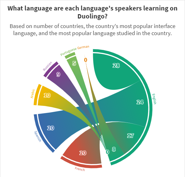
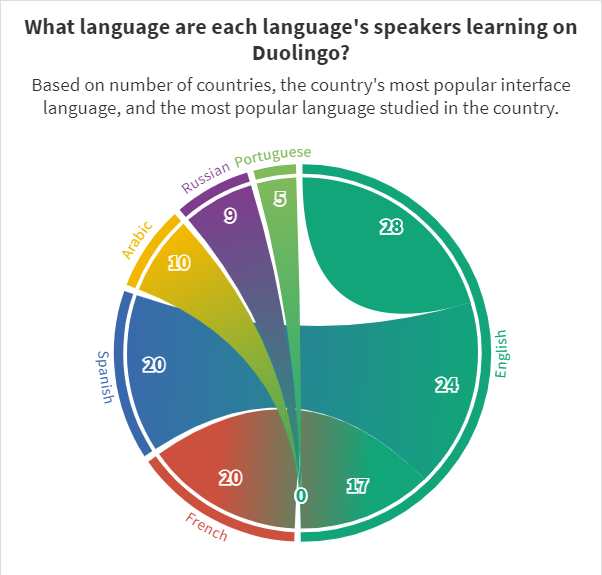
- Duolingo
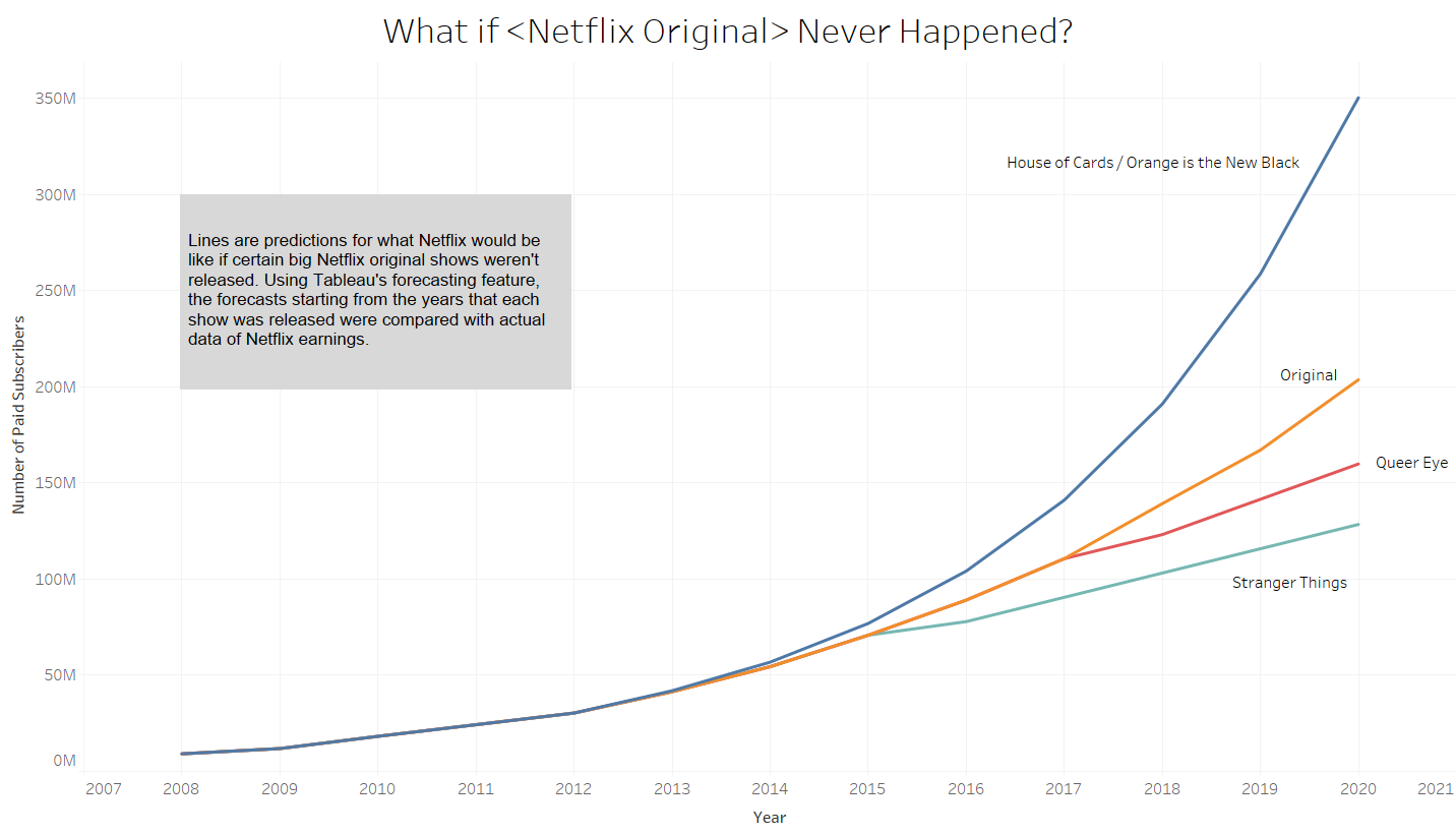
- Netflix Originals
- Reorganisation
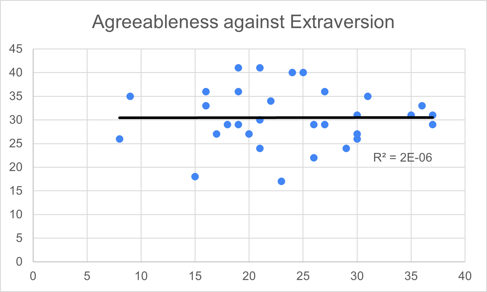
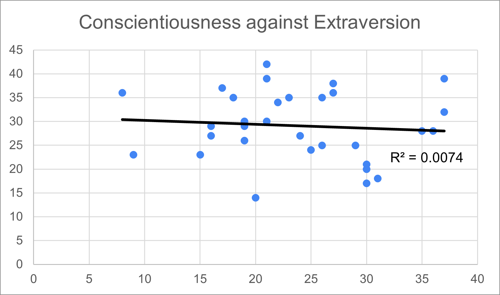
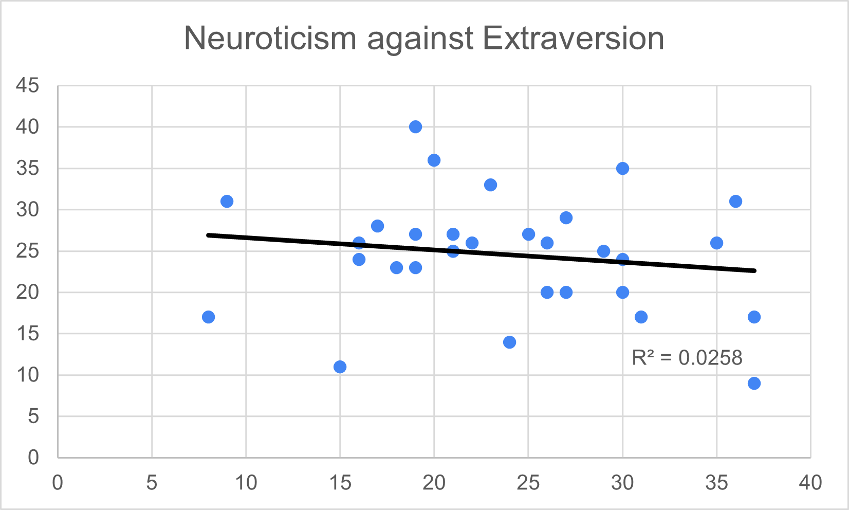
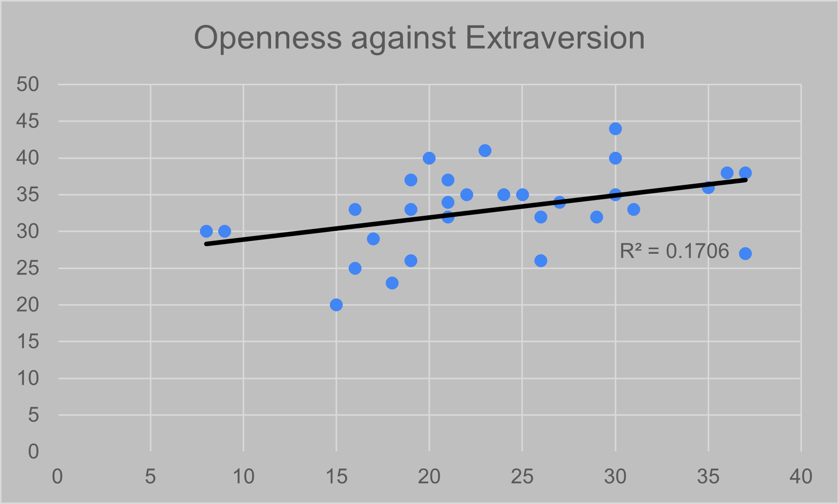
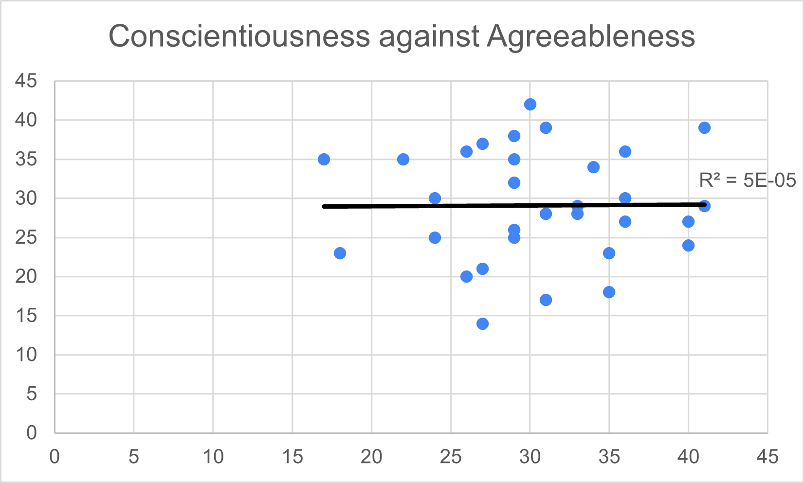
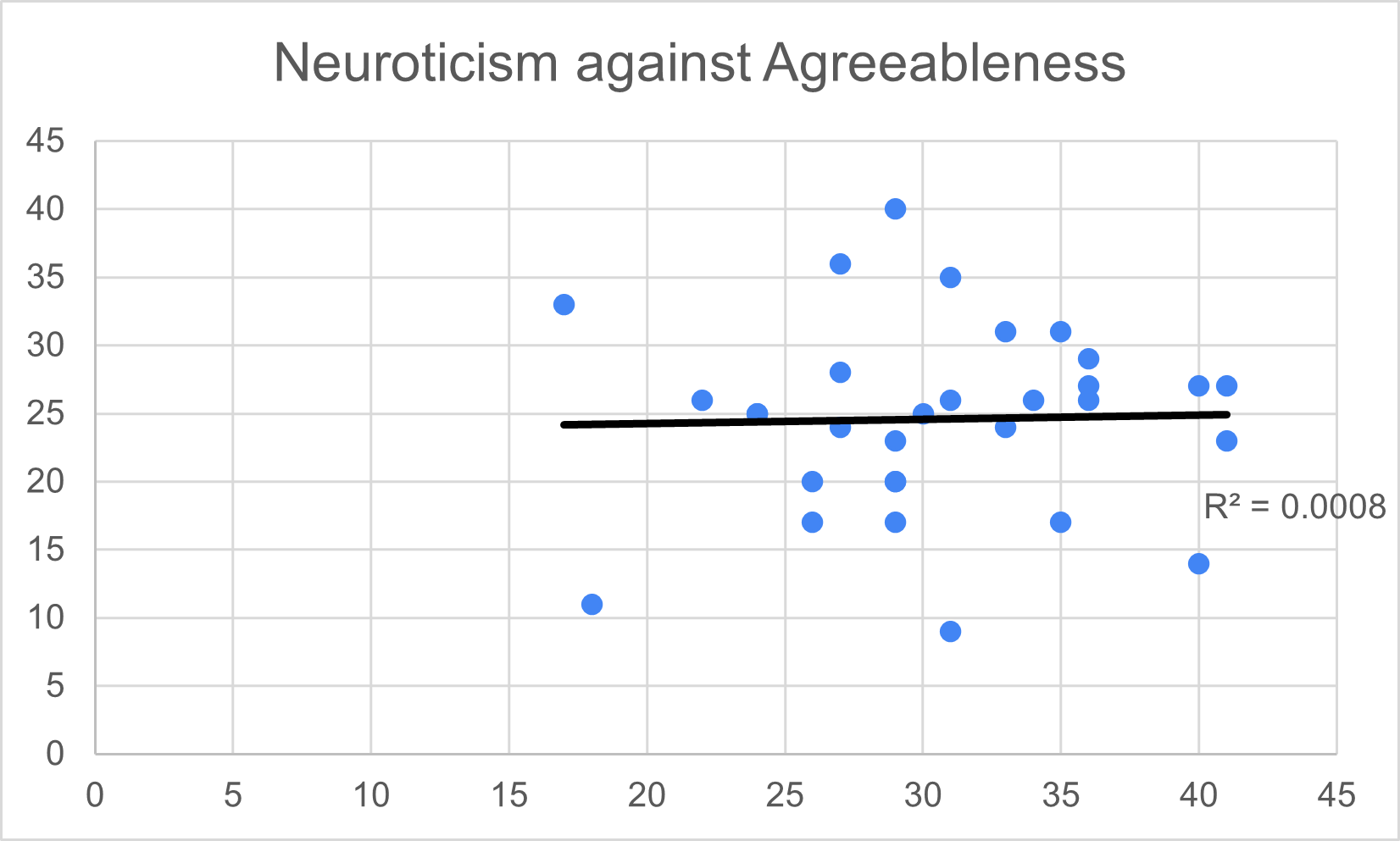
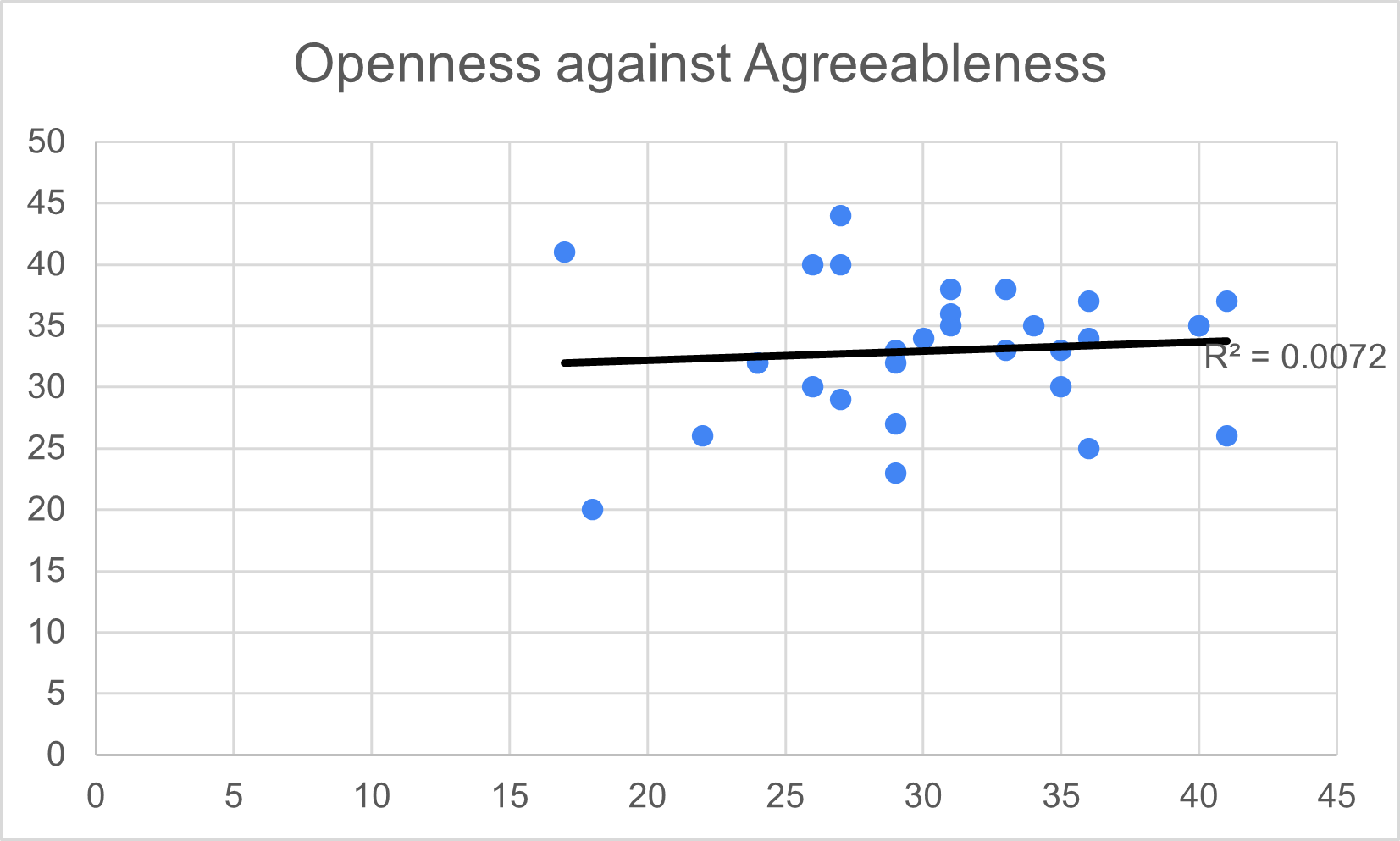
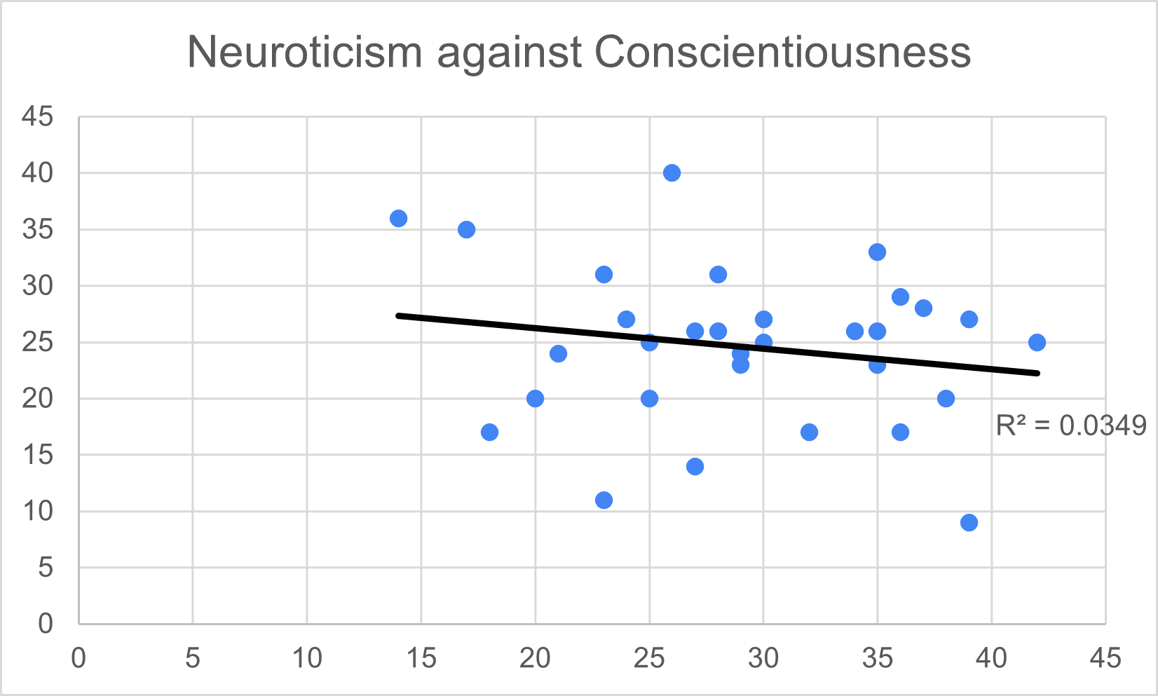
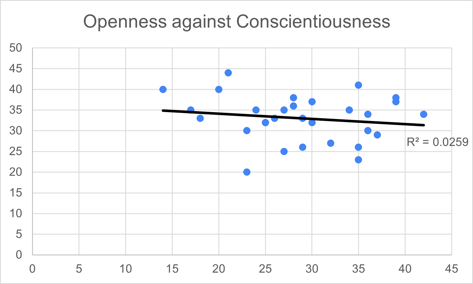
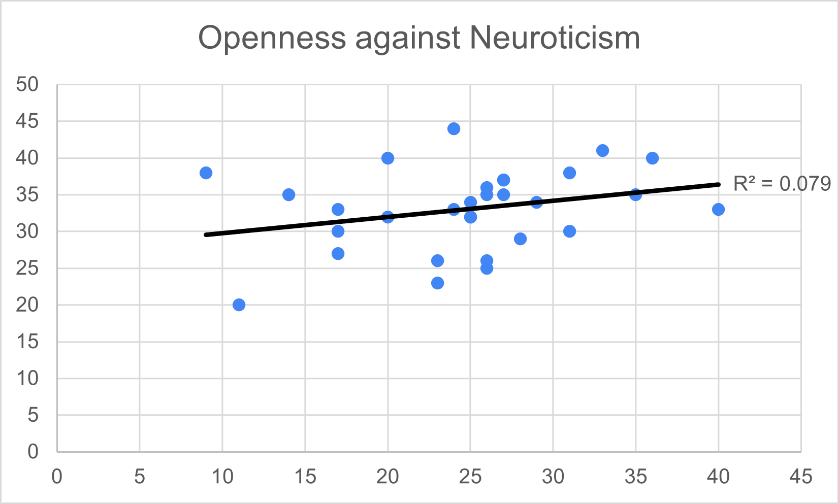
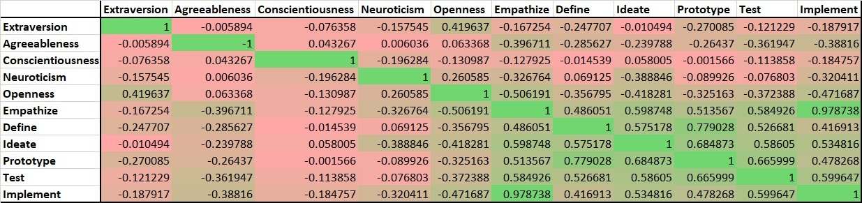
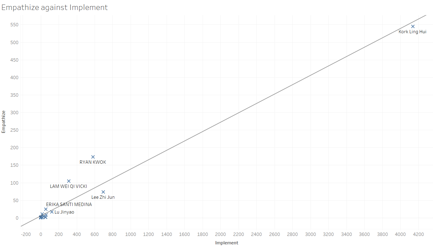
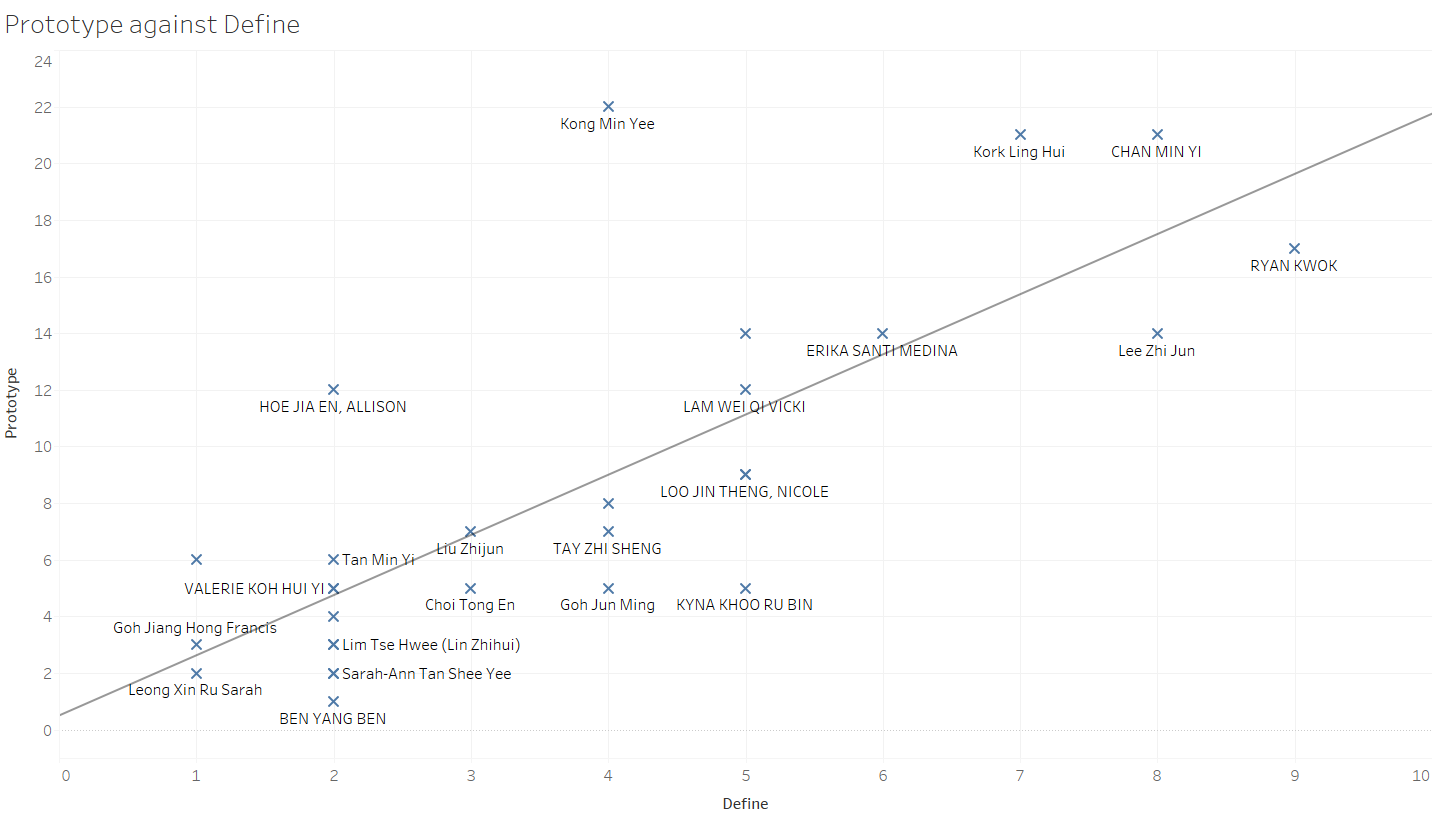
Big 5
The Big 5 is a personality test that the class took. This set of visualisations attempt to graph the collective results.
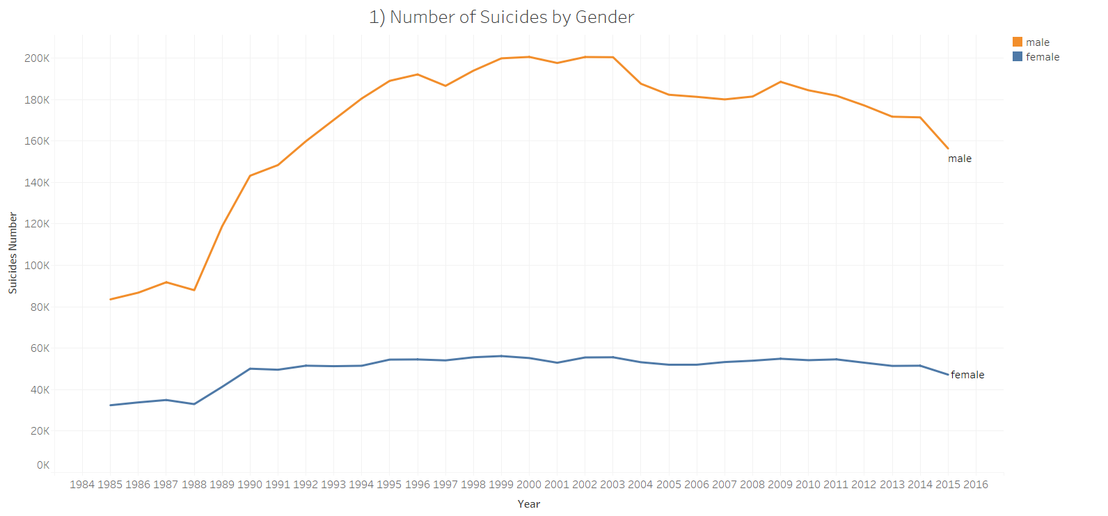
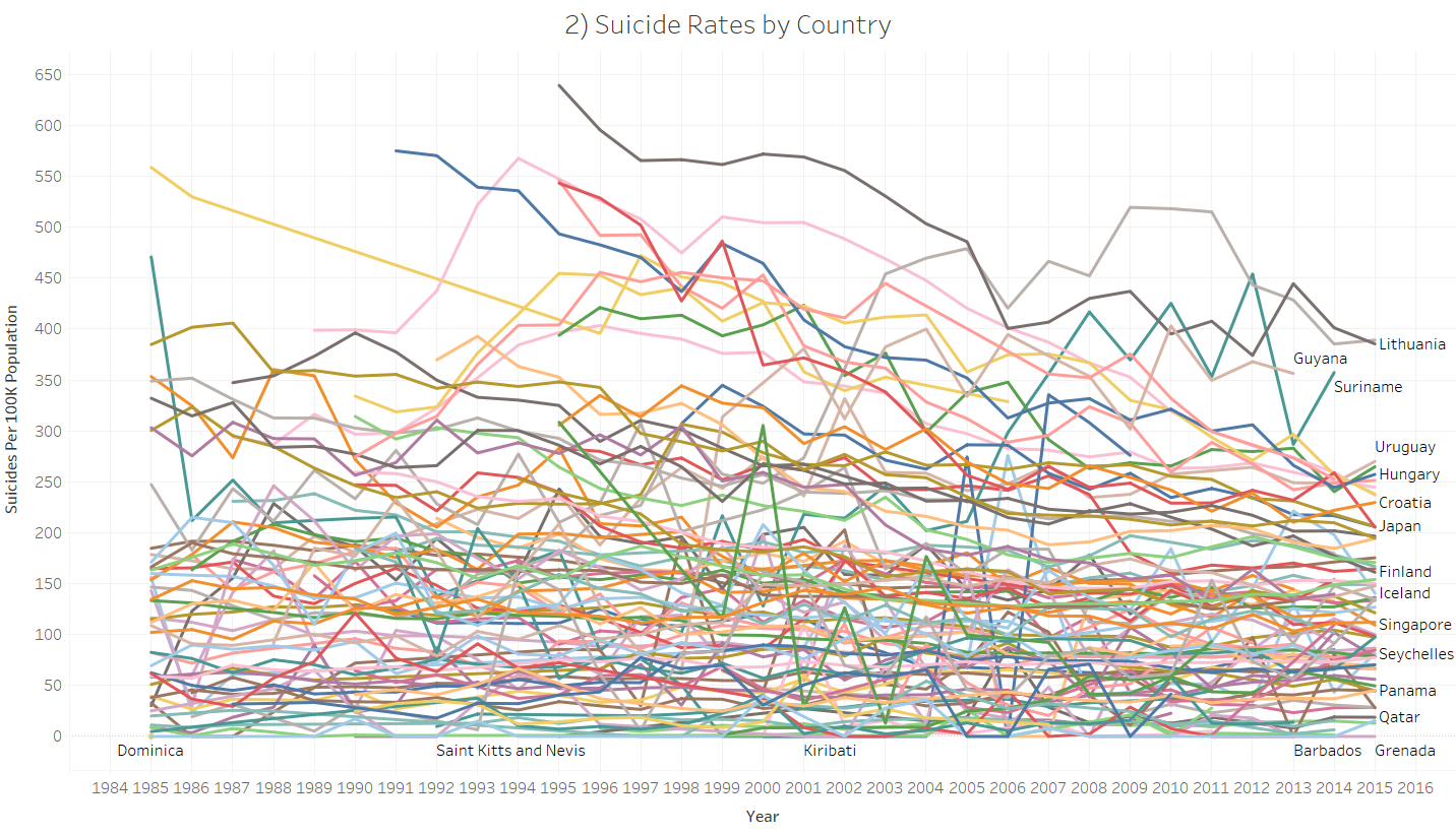
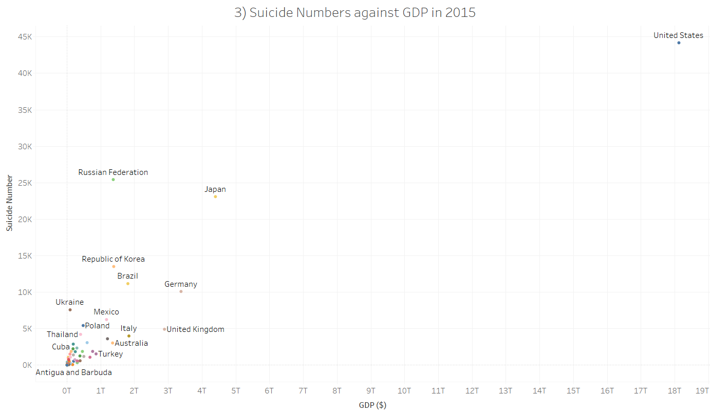
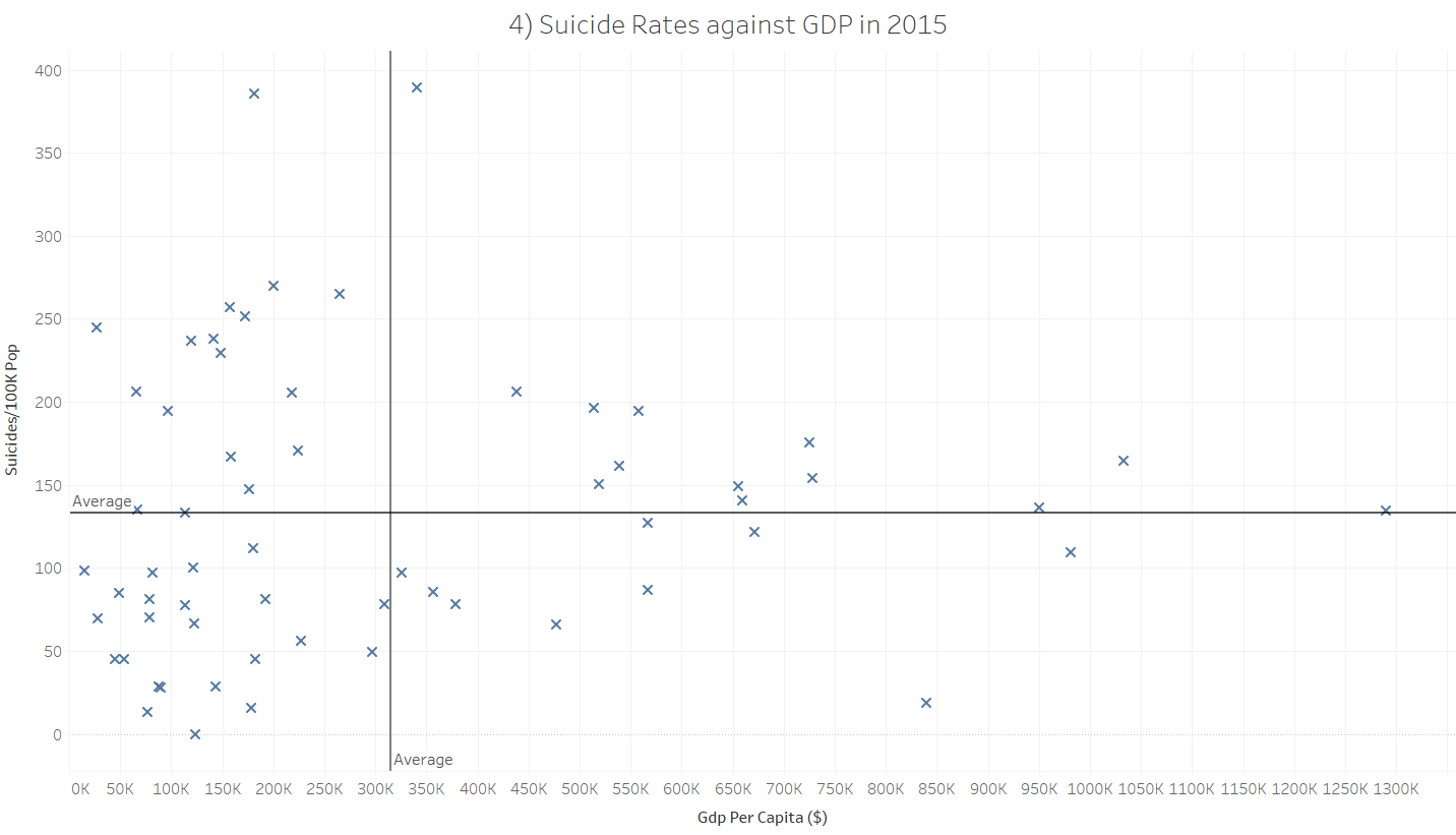
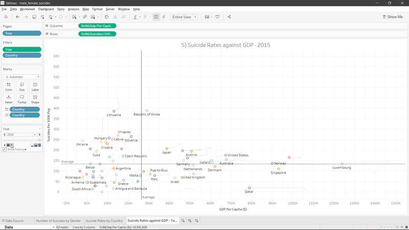
Suicides
This set of charts analysed suicide rates.
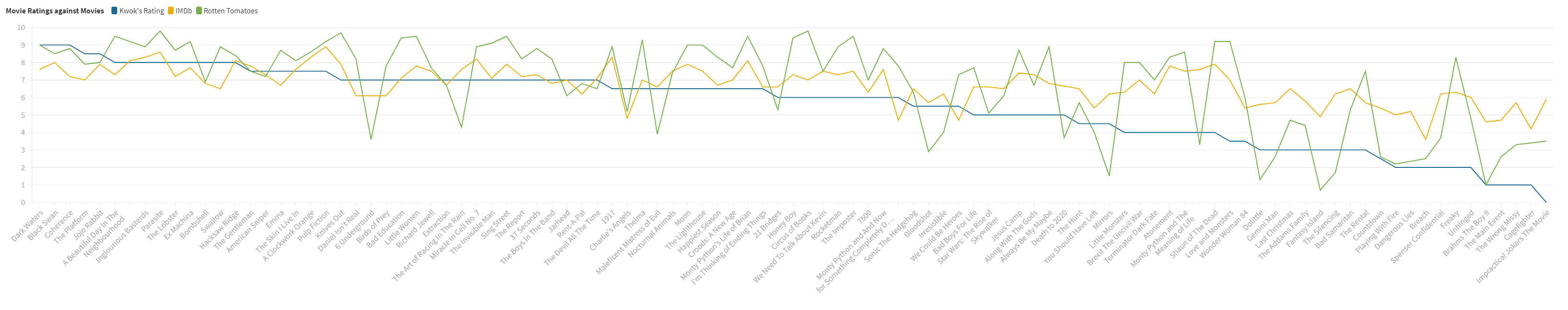
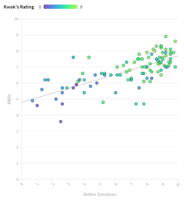
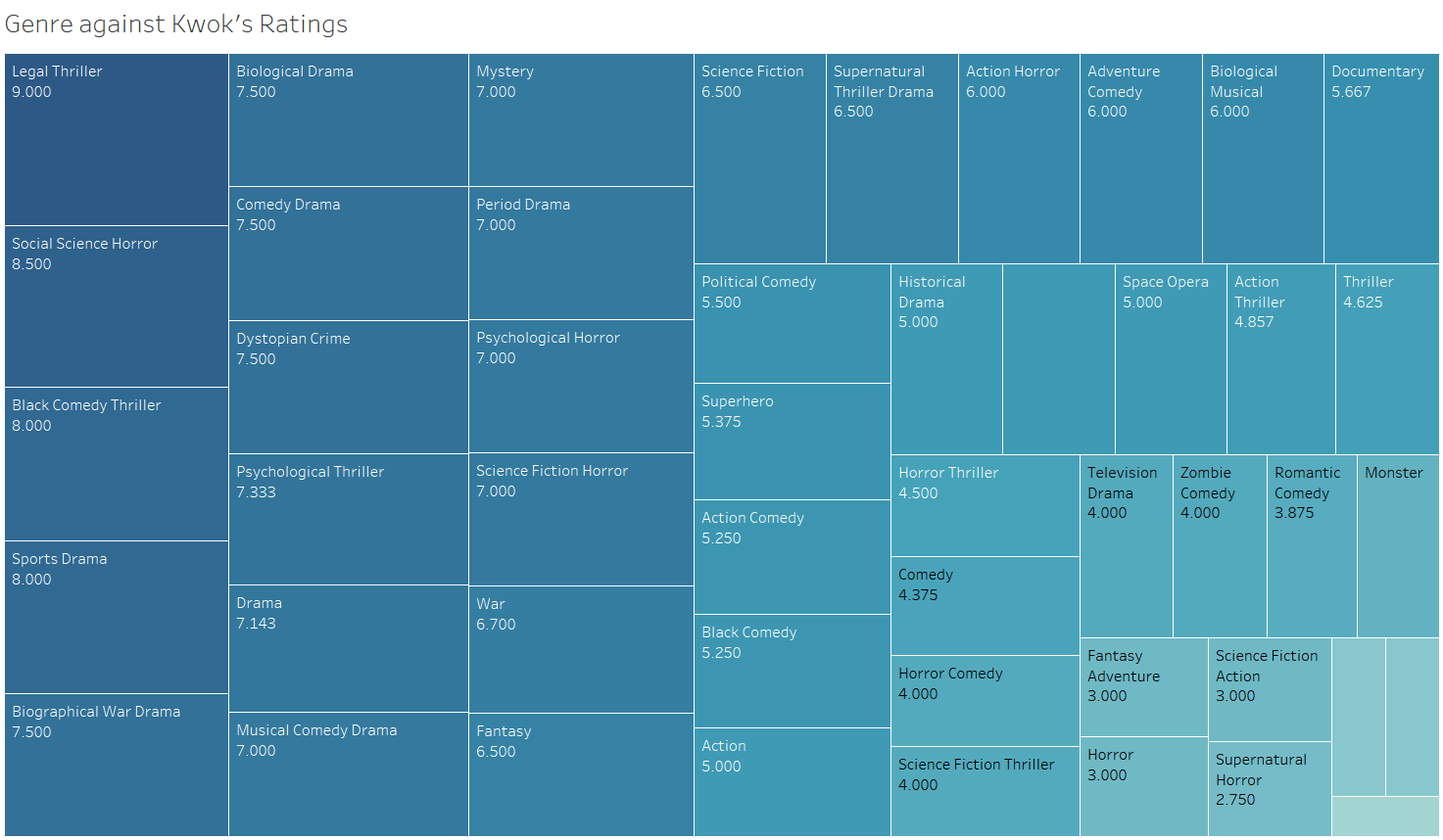
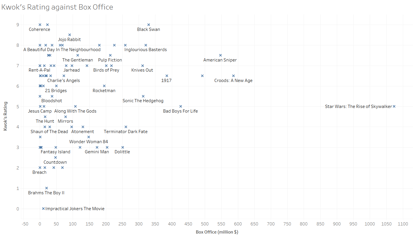
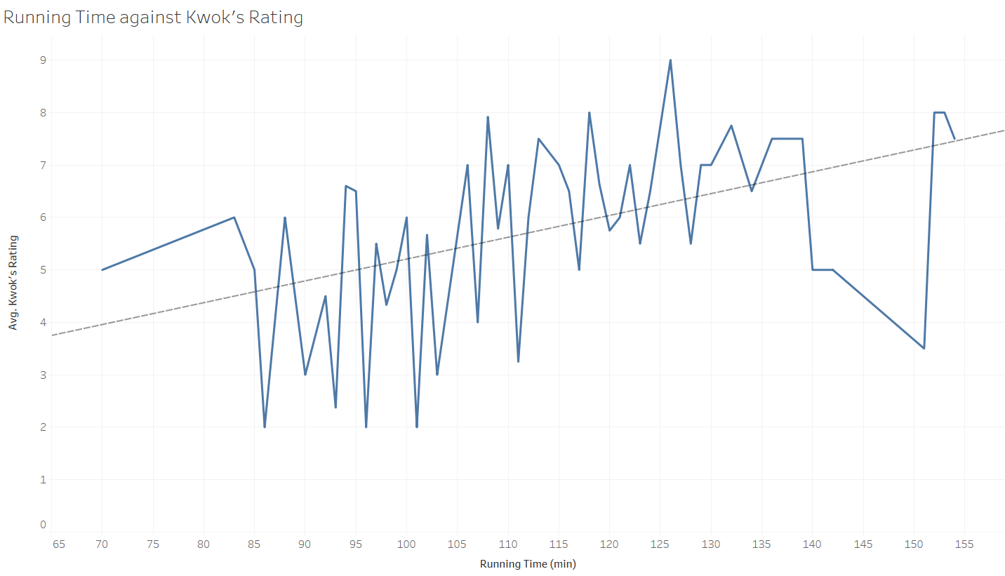
Movie Ratings
Being a huge movie fan, I compared my own ratings of movies I had watched against IMDB and other movie statistics.
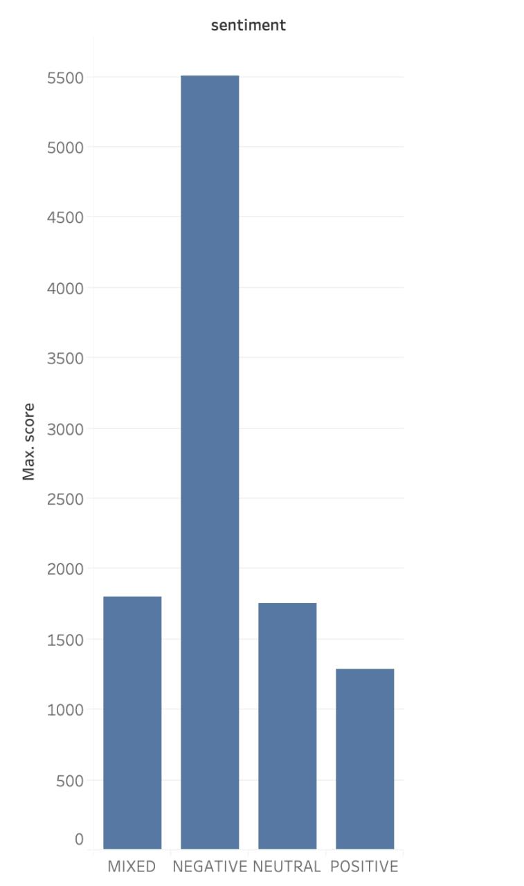
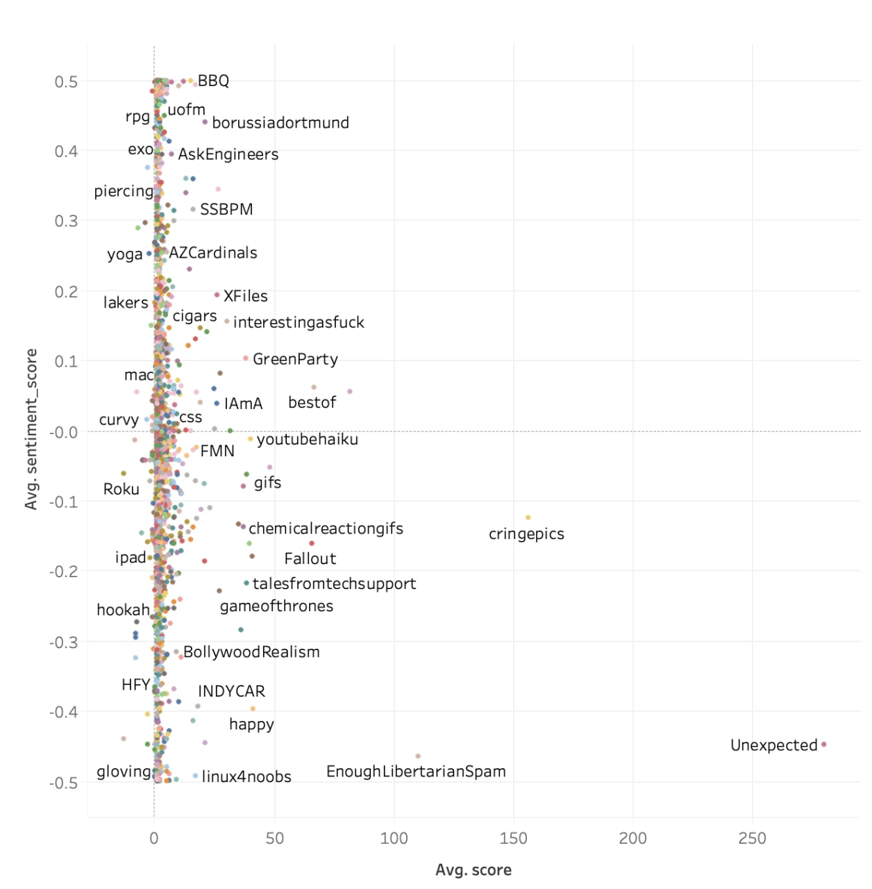
Sentiment Analysis
This was done in collaboration with Ling Hui and does sentiment analysis on Reddit comments.
30% Rule
This two gifs were inspired by the rule that states that one should only spend 30% of their salary on rent.
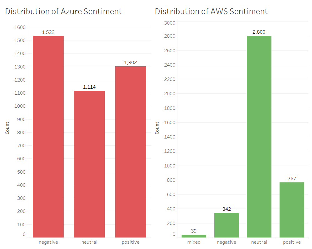
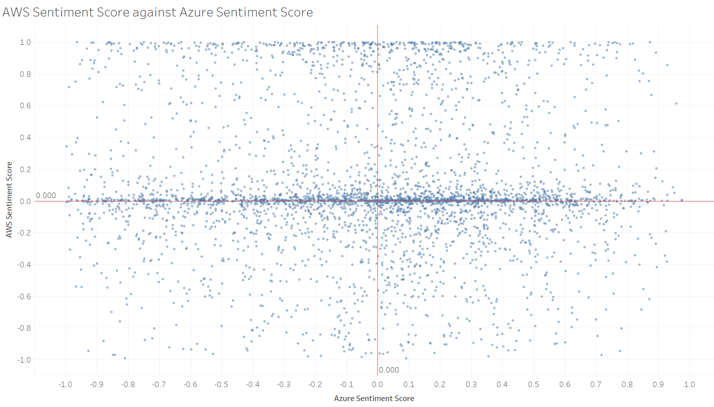
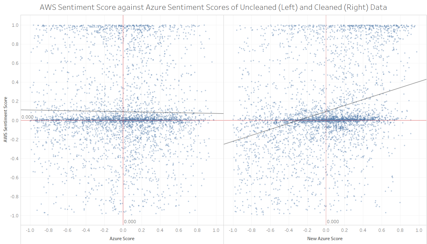
Comparing Machine Learning
Comparing Amazon Web Service Comprehend and Microsoft Azure Sentiment Analysis, these two graphs were created based on tweets.
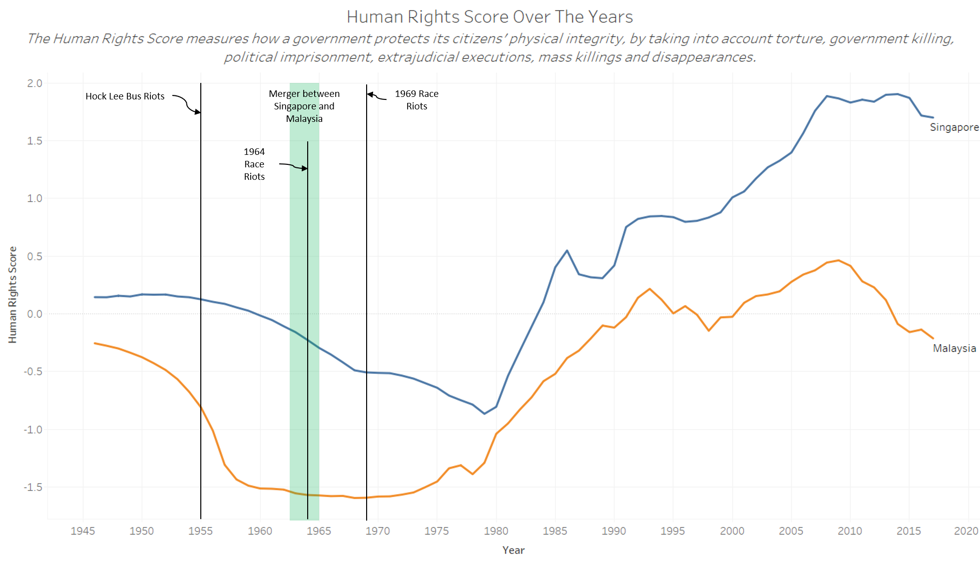
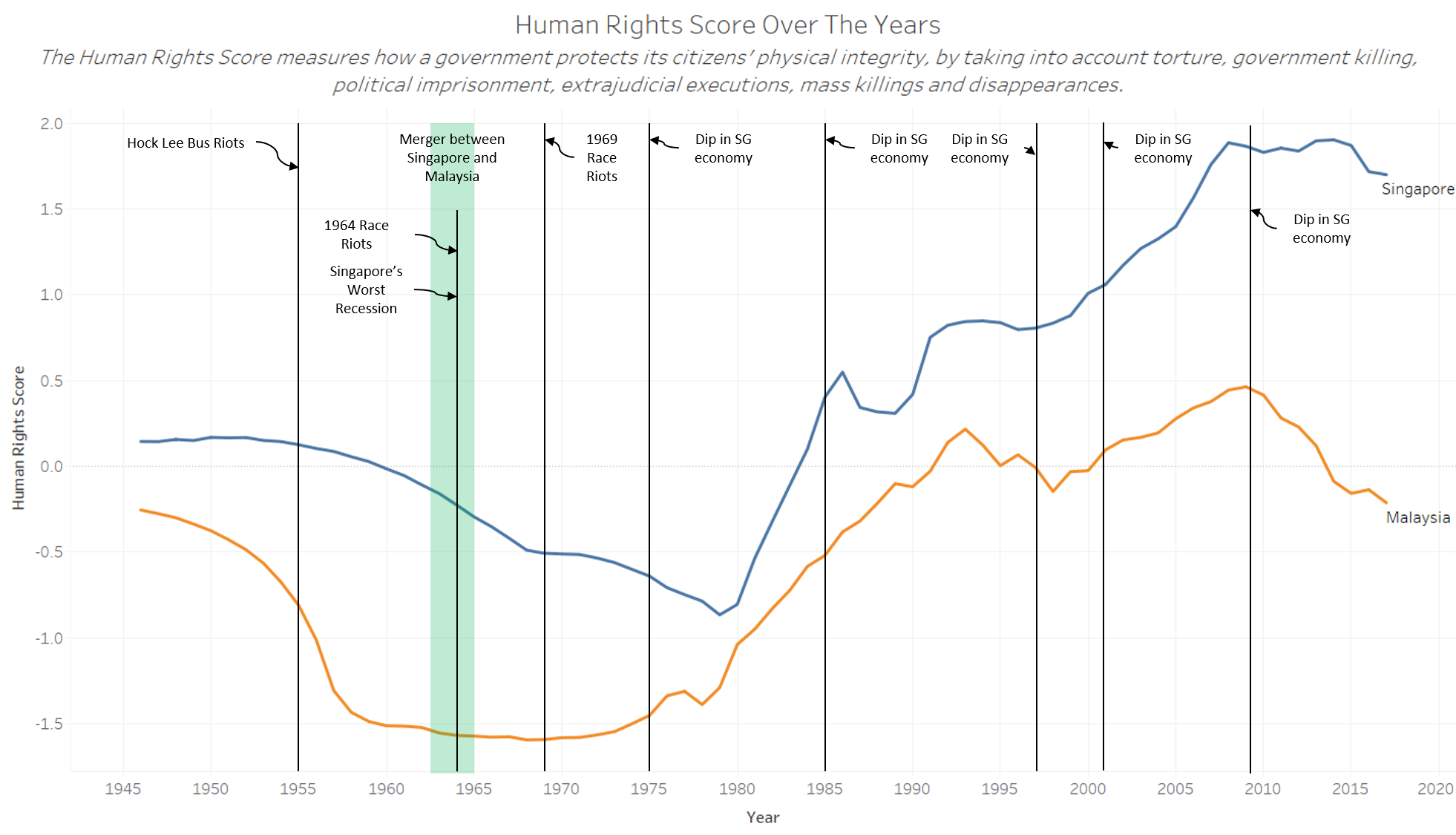
Human Rights
This graph was created to compare human rights score in Singapore and Malaysia.
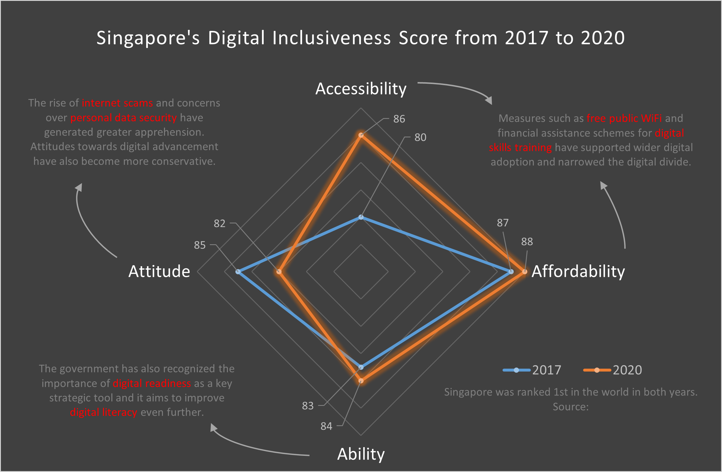
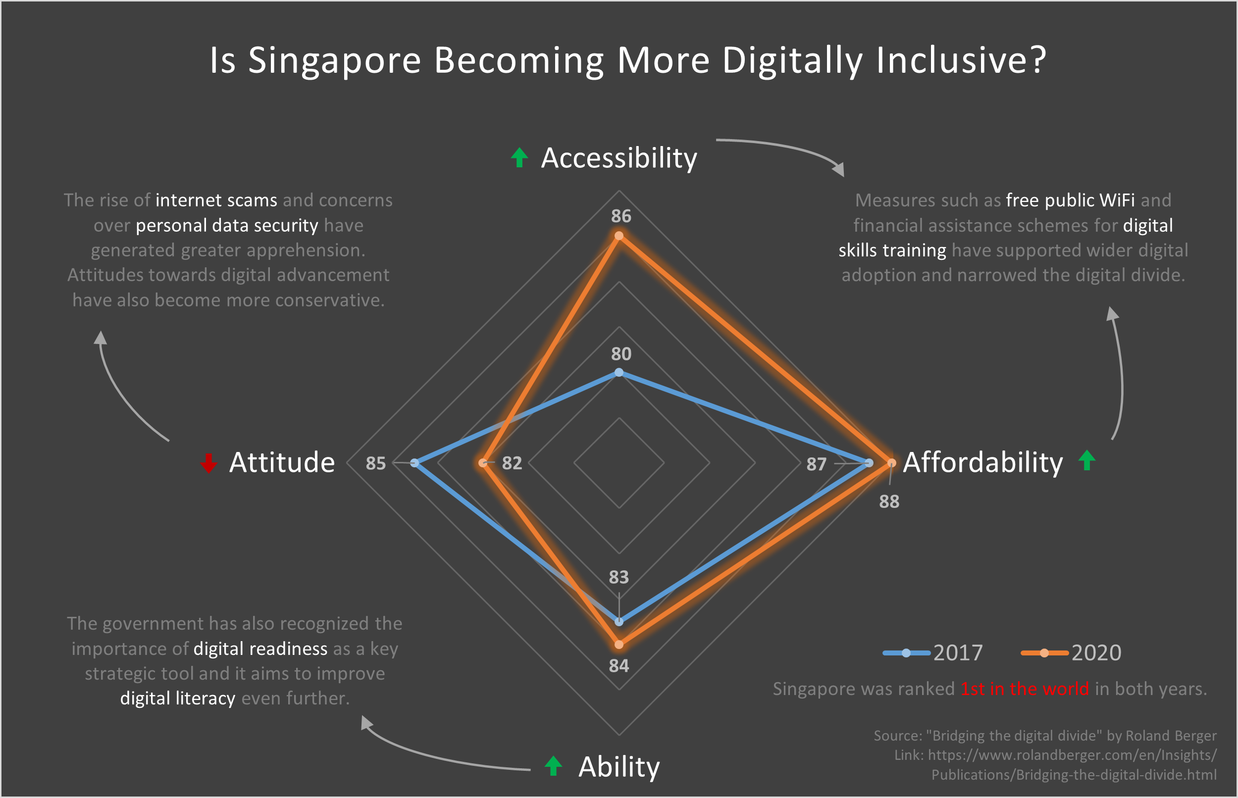
Digital Inclusion
Inspired by the Roland Berger study, this set of graphs describes how digitally inclusive Singapore is.
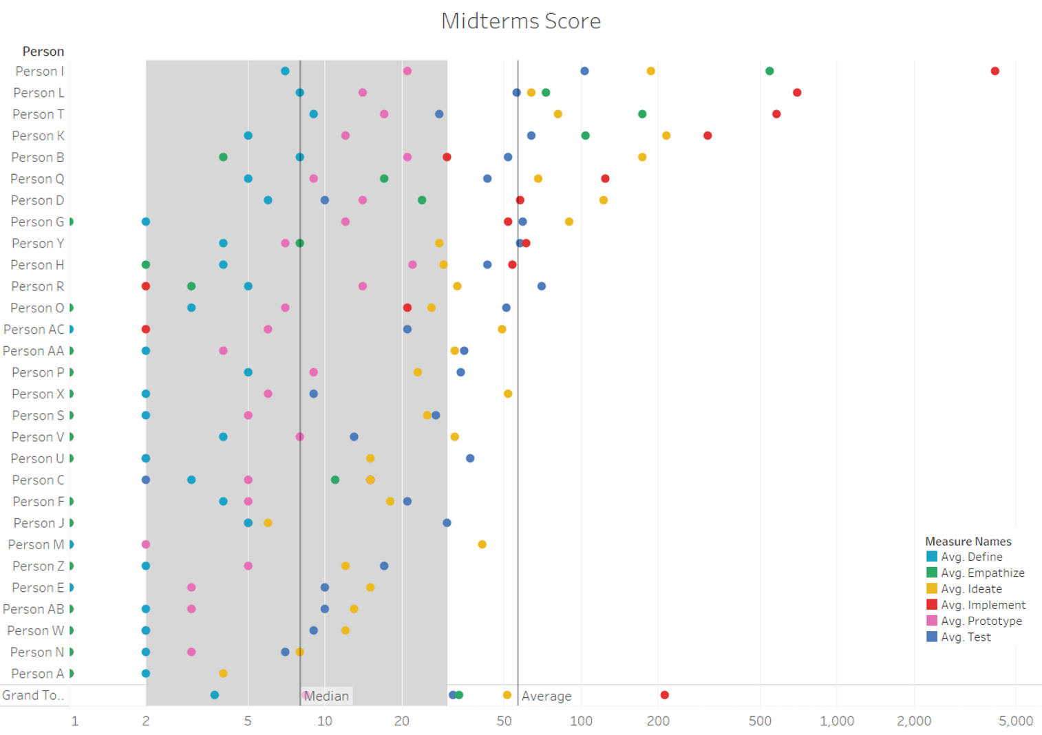
Midterm Results
Dr. Burke had released our midterm scores and the following set of visualisations attempt to describe that dataset.
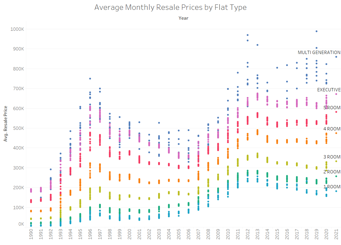
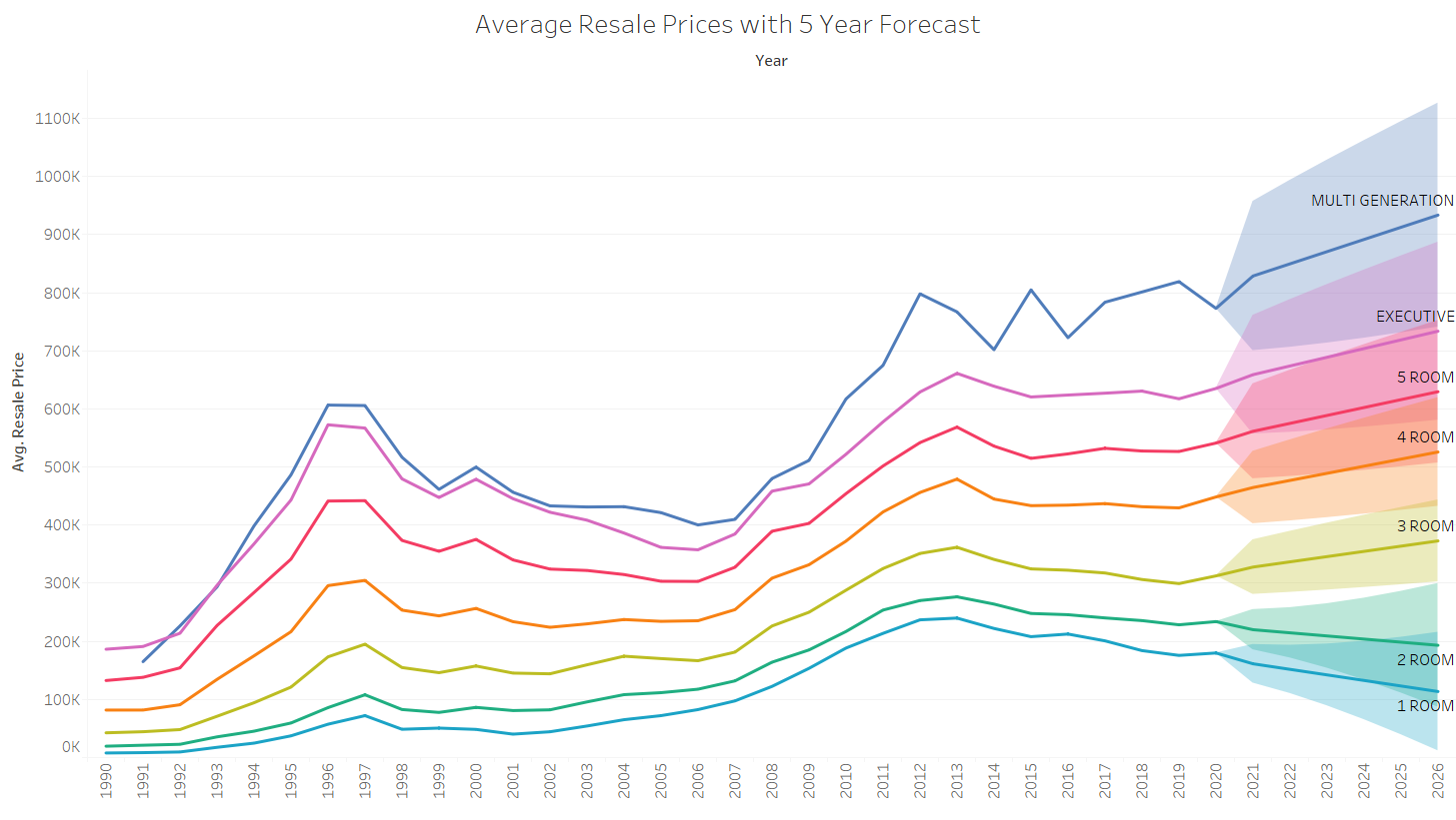
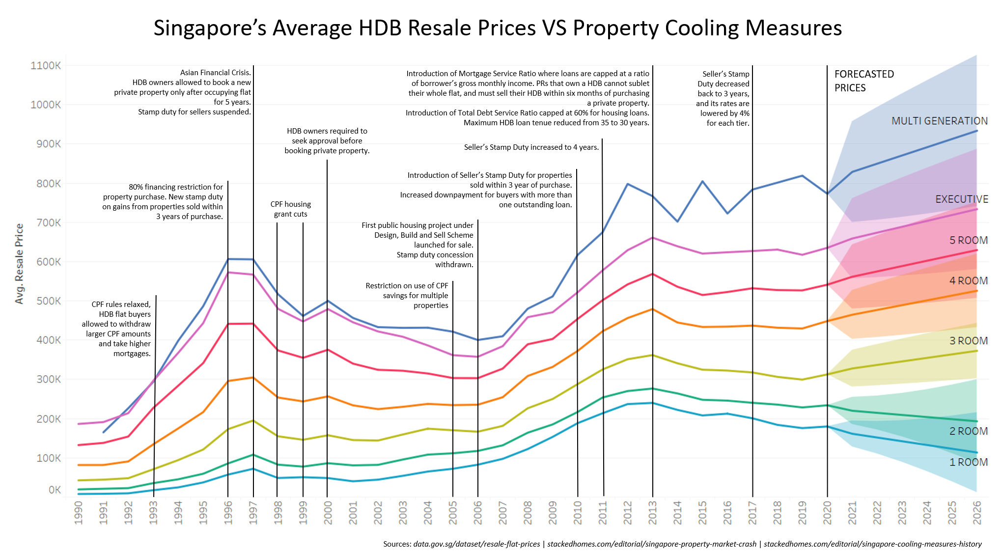
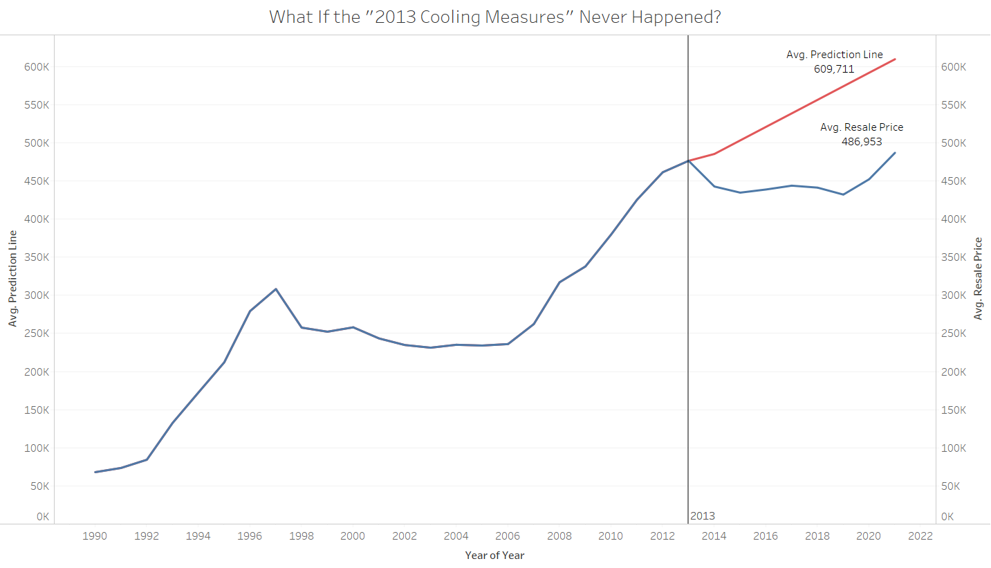
Resale Flats
This was spawned from a conversation I had with my girlfriend about buying a house.
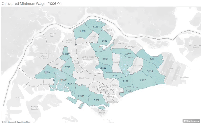
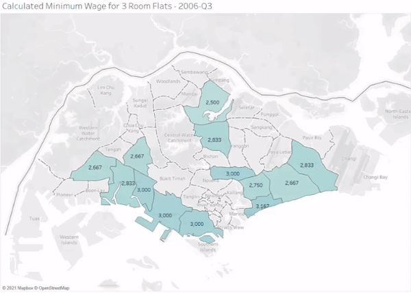
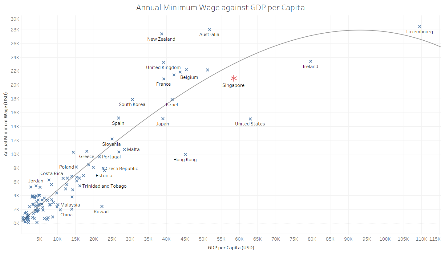
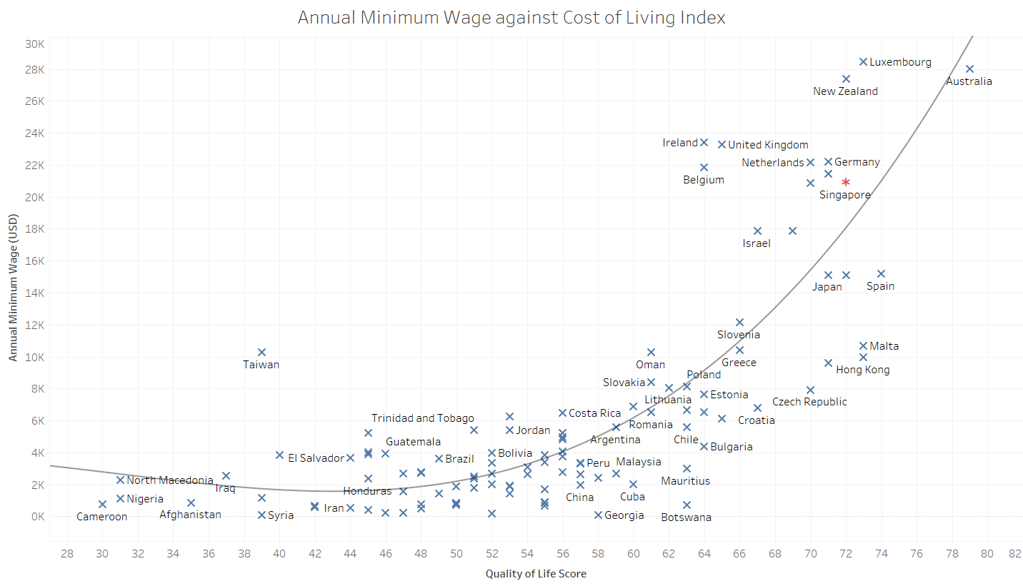
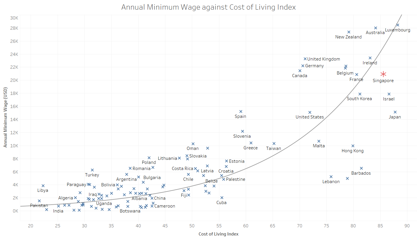
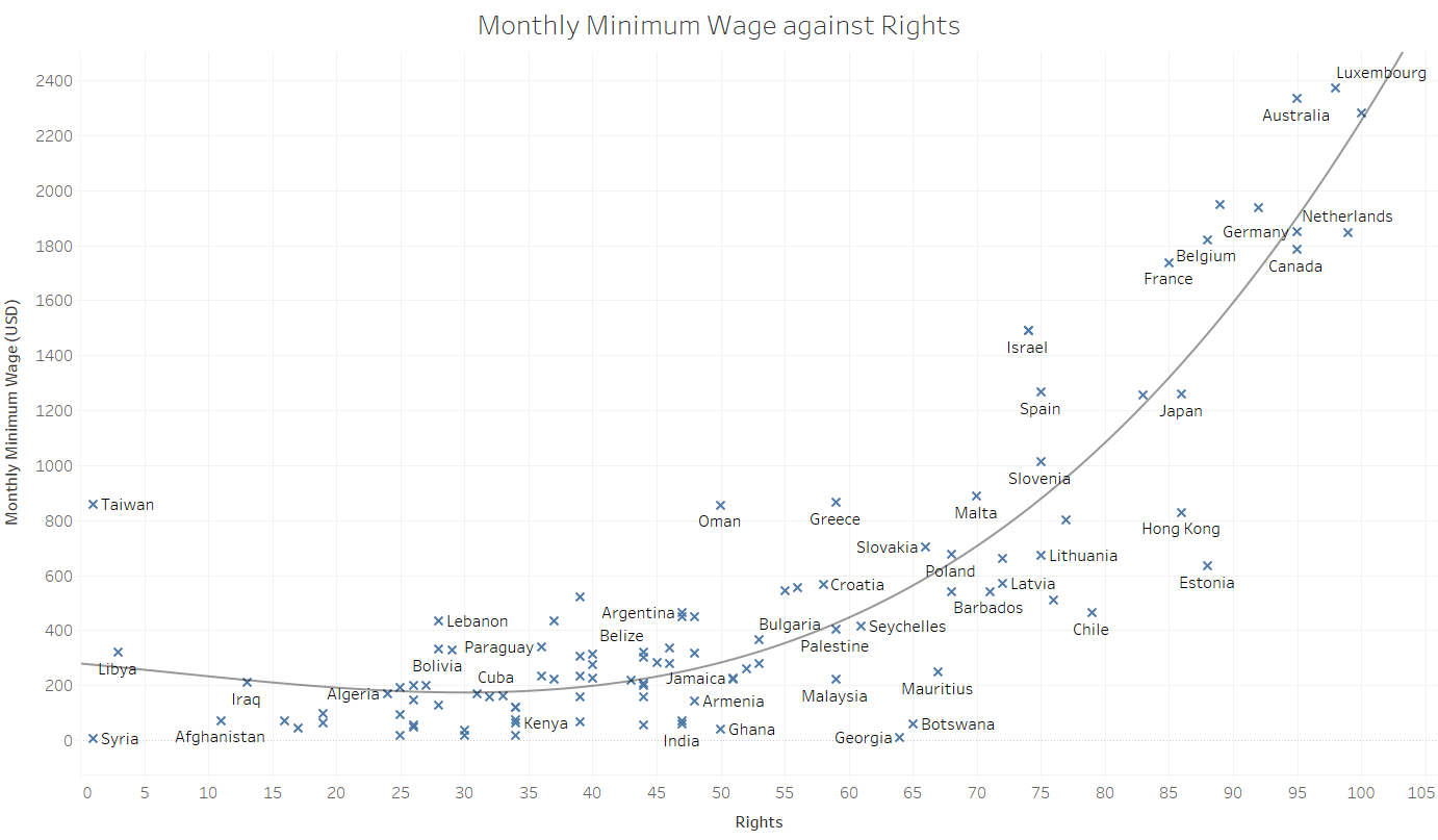
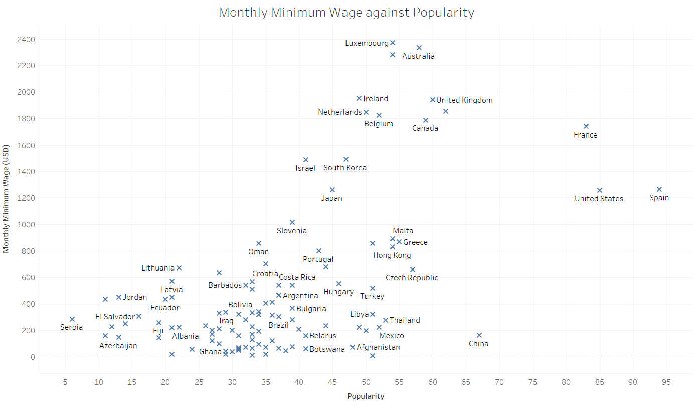
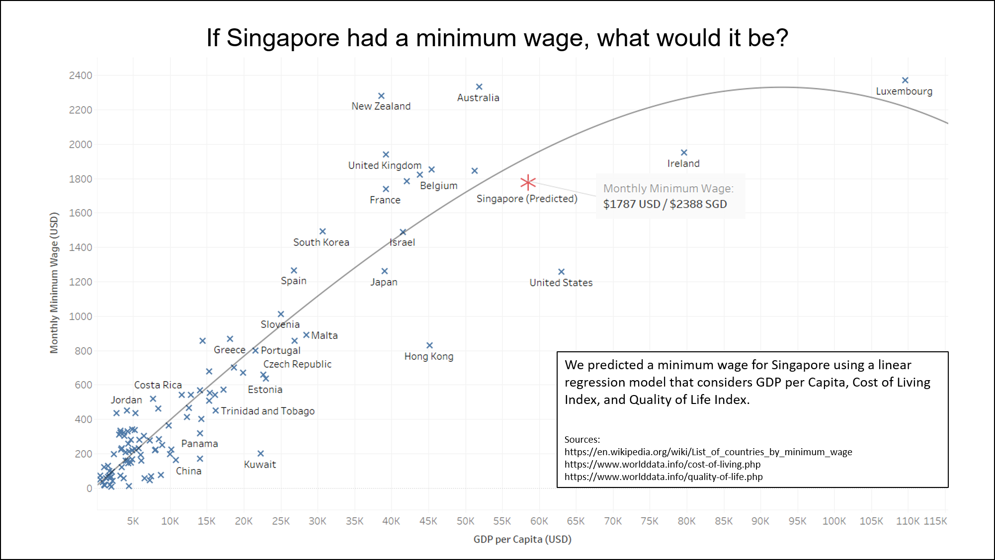
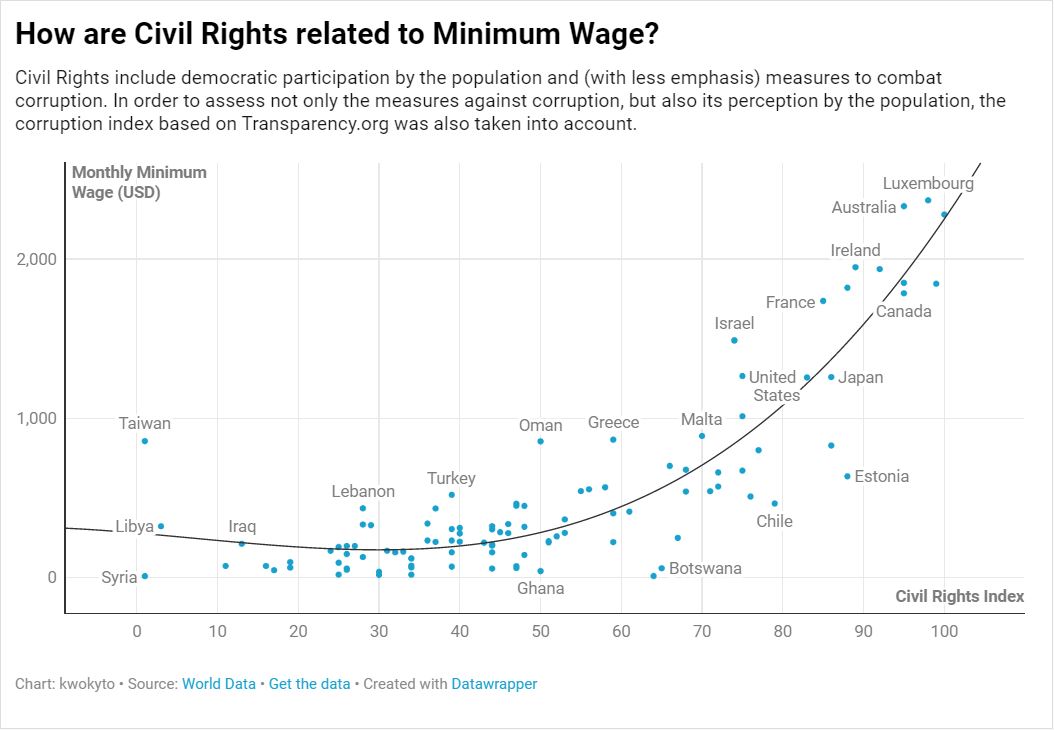
Minimum Wage
This was conducted in collaboration with Erika, who shared a common interest in minimum wage.
Women Ministers
This set was conducted in collaboration with Rhea, who was interested in women in position of power.
women_ministers_1 women_ministers_2 women_ministers_3
Avengers
These two videos attempted to develop an indicator of how popular each Avenger was.
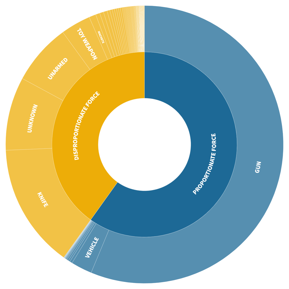
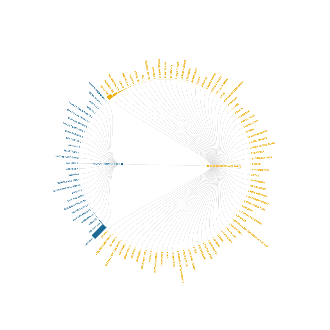
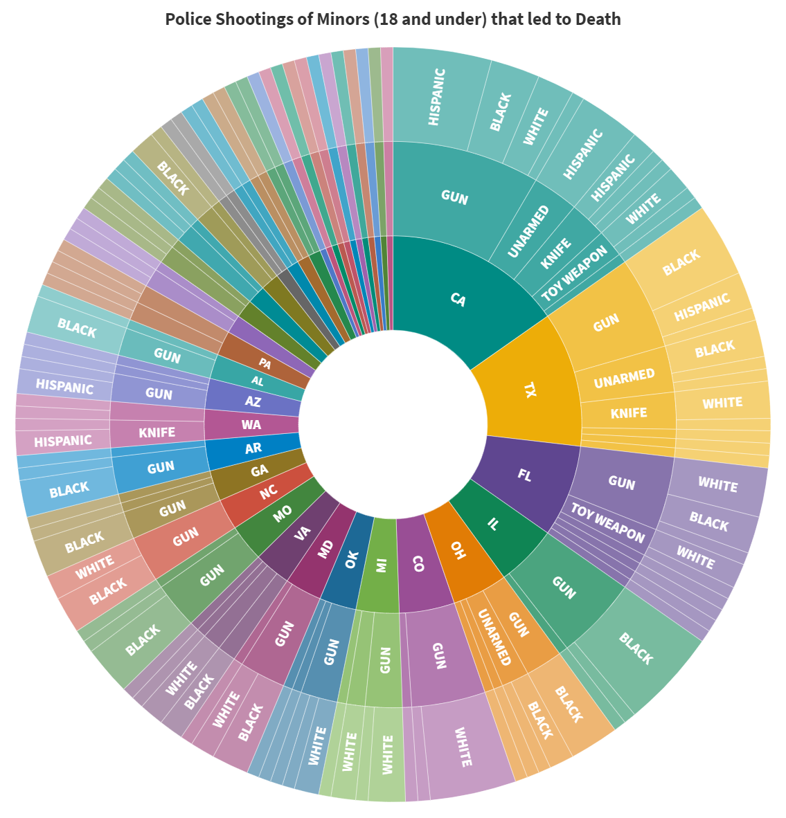
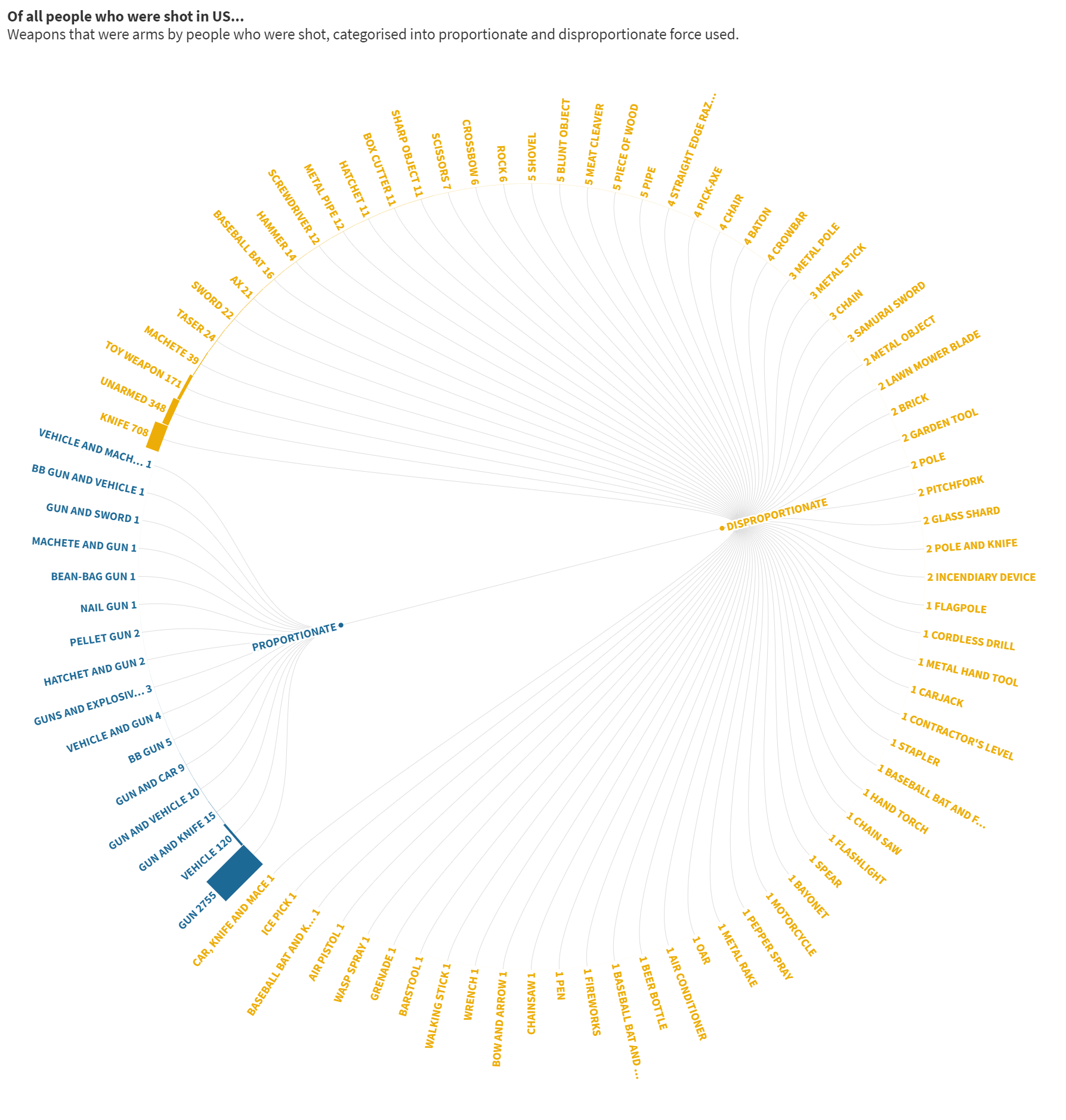
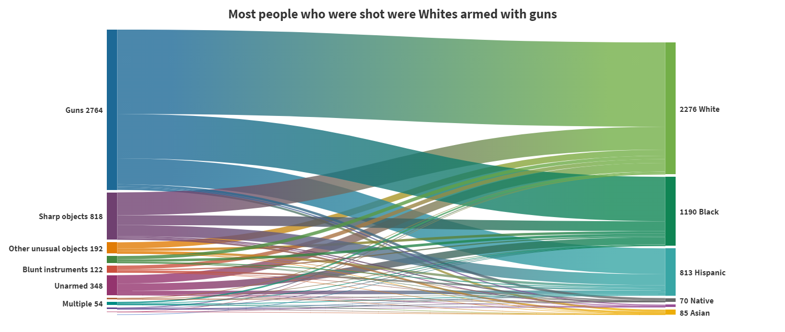
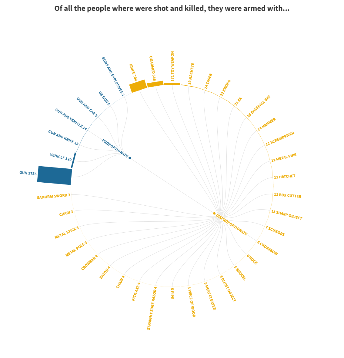
Shootings
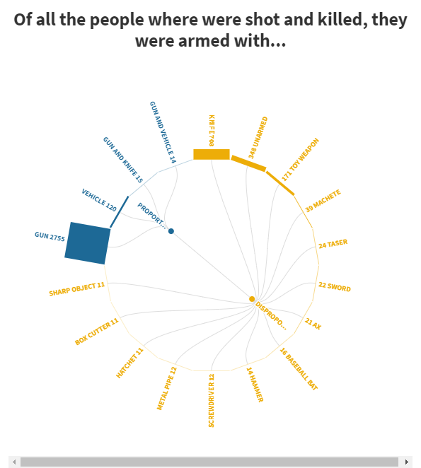
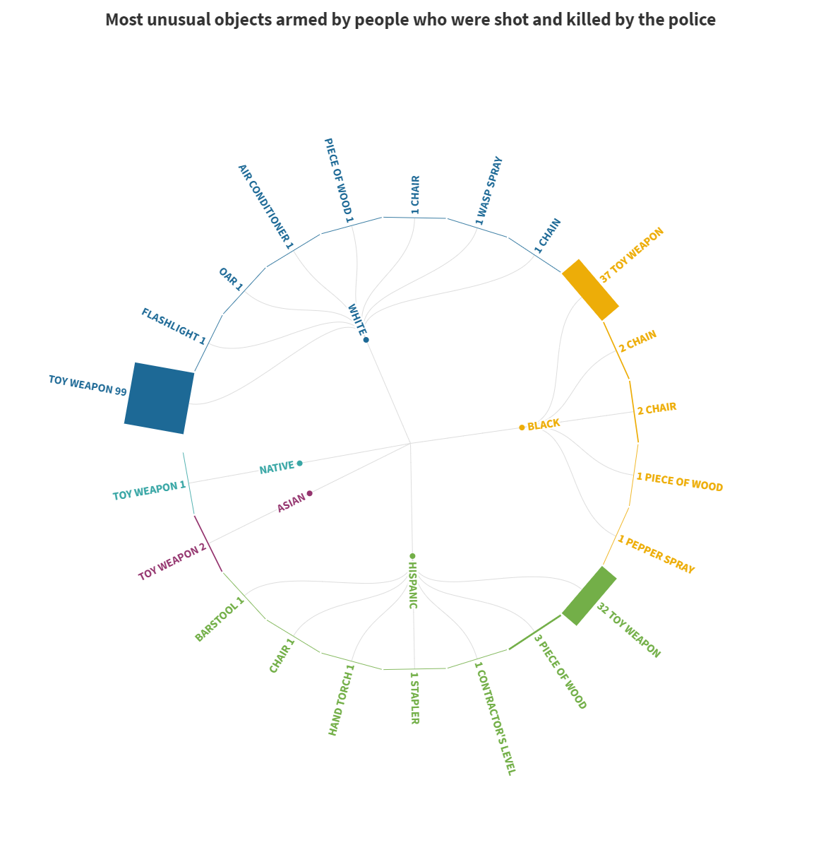
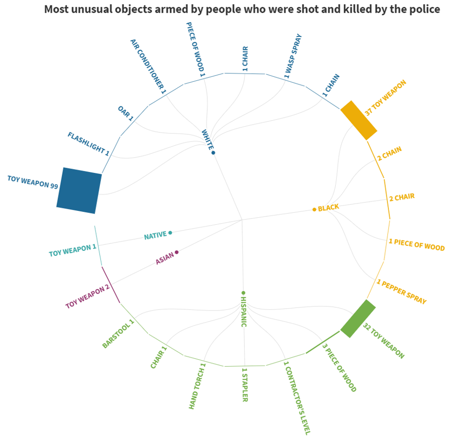
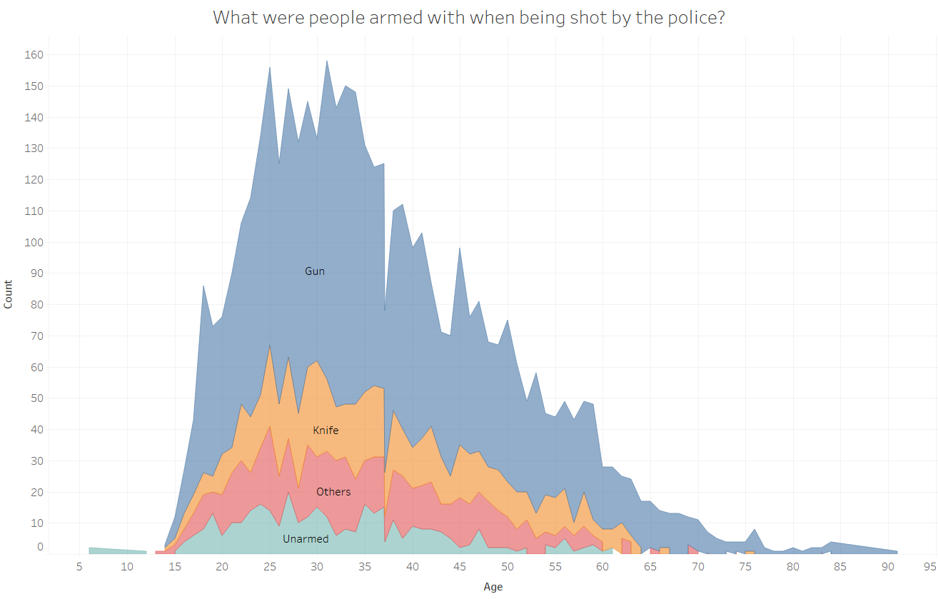
This set of visualisations explored the use of sunburst and radial charts using a dataset about police shootings in the US, and done in collaboration with Ling Hui.
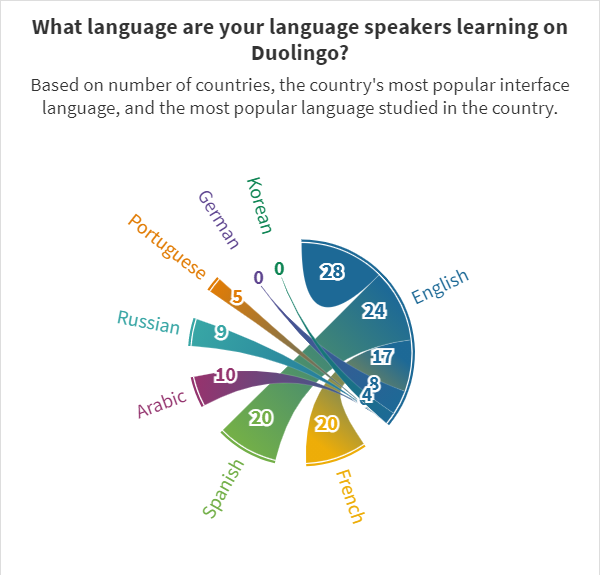
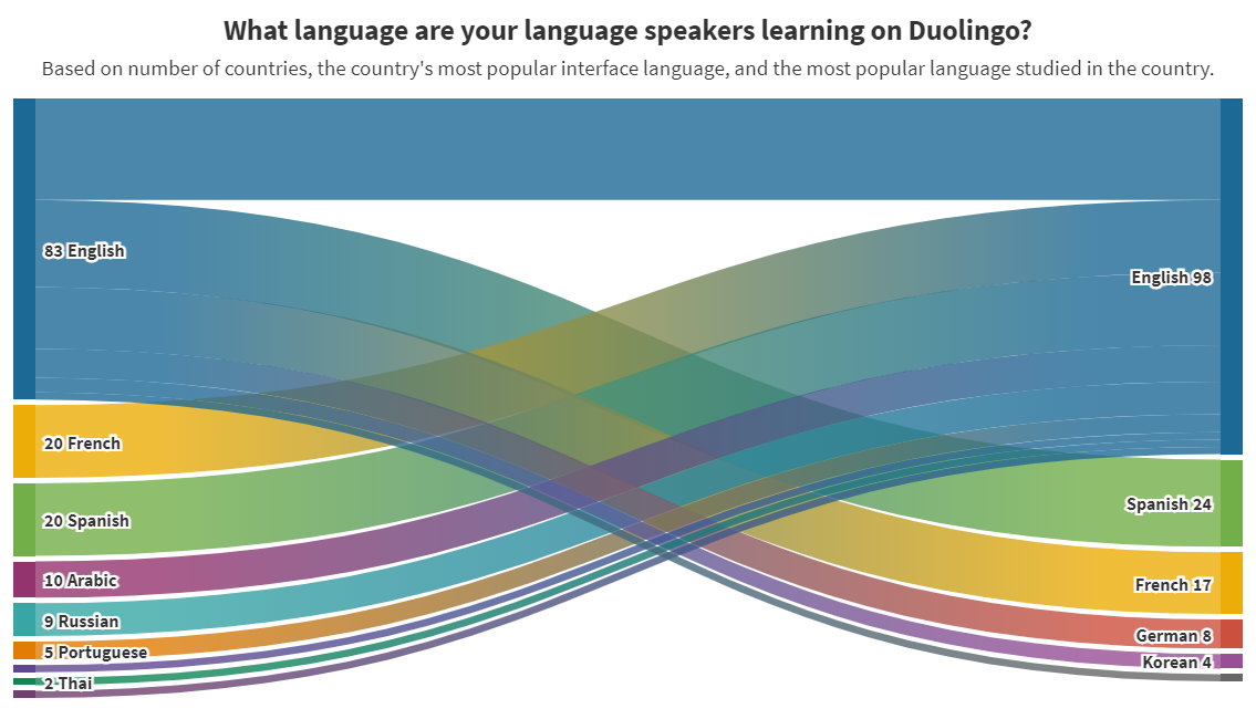
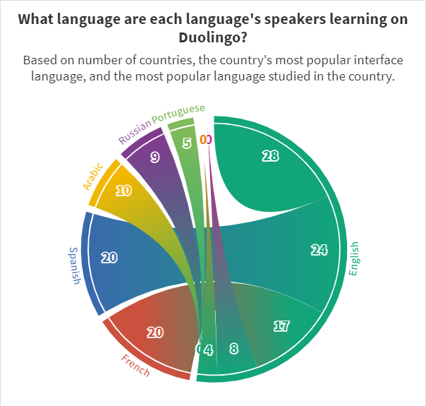
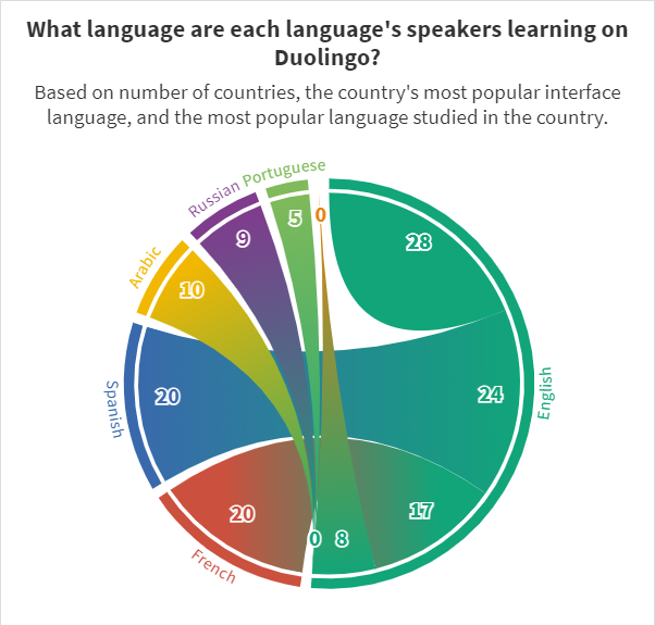
Duolingo
This set of charts referenced Duolingo statistics, with the emphasis on the use of chord diagrams.
Netflix Originals
This was done in collaboration with Valerie over our shared love in Netflix.
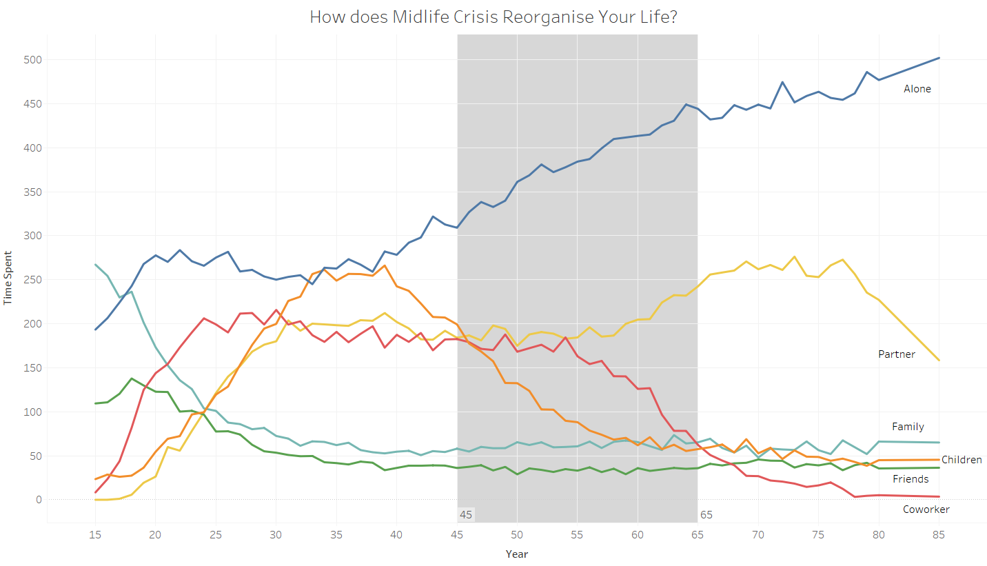
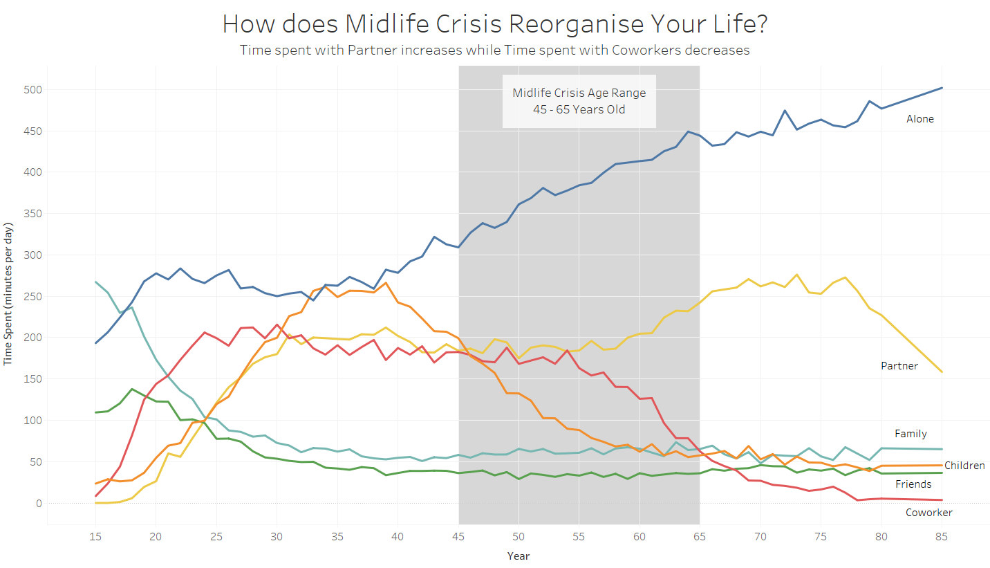
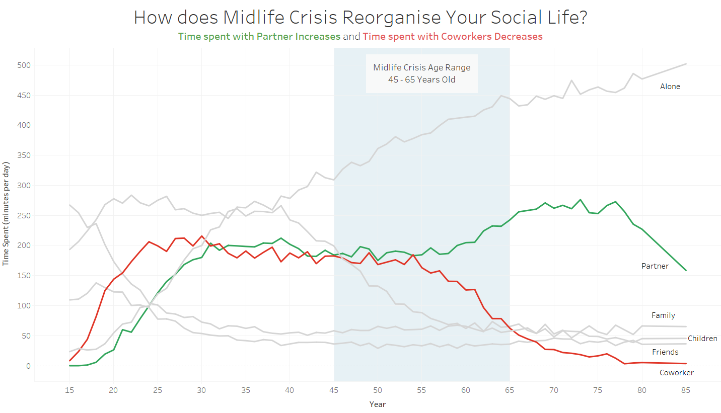
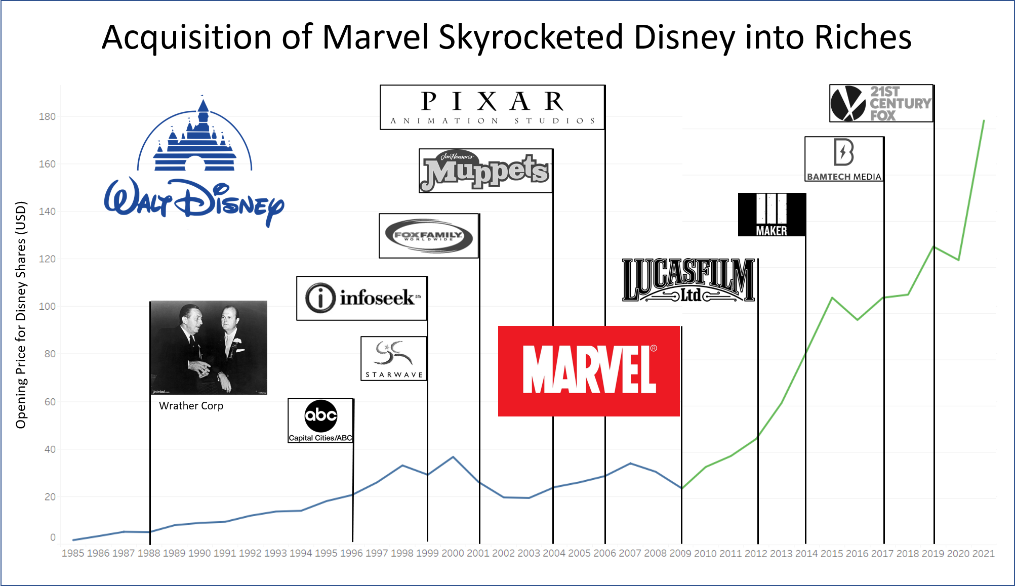
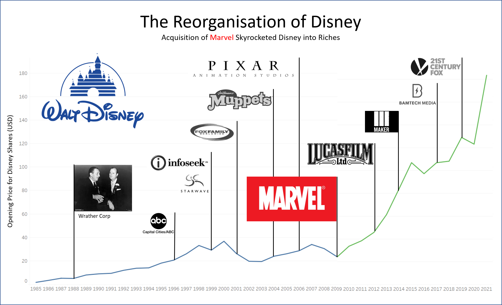
Reorganisation
This set of visualisations were done during the informal hackathon conducted during the last week of lessons, and co-created with my partner Kok Lee.